
Websites
Why your website has to work on a phone first
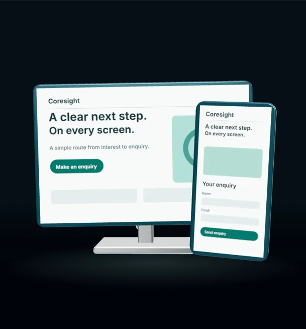
Your website has to work on a phone first, because that is where most of your customers will see it. Think about how people find a local business. They are standing next to a car that will not start, looking at a leaking ceiling, or deciding what to have for tea on the sofa. They pull out their phone, search, and tap the first result that looks right. If your site is hard to use on that small screen, they go back and tap the next one.
This article explains what "phone first" means in practice, why Google cares about it too, and how to check your own site in ten minutes.
What "phone first" really means
Many websites are designed on a big computer screen and then squeezed down to fit a phone afterwards. The result is often tiny text, buttons too close together, and important details hidden at the bottom of a long page.
Designing phone first flips that order. You start with the small screen and decide what someone needs in the first few seconds. For most local businesses that list is short:
- What you do
- Where you do it
- How to contact you, right now
- Some proof that you are good at it
Everything else can come further down the page or on the computer layout.
Google looks at the phone version
Google mainly uses the mobile version of your site when it decides where to rank it. That means a site that looks fine on your office computer but struggles on a phone is judged on the struggling version.
Speed is part of this. A page that takes a long time to appear on a 4G connection in a car park will lose visitors before they have read a word. Large uncompressed photos are the usual cause, and they are one of the easiest things to fix.
The call button is the most important thing on the page
For a trade business, the best outcome from a website visit is usually a phone call or a message. So make it easy.
A garage site should have a tap-to-call button near the top of every page, big enough to hit with a thumb, with the number written out in full. A takeaway should put the order button where nobody has to hunt for it. A builder might offer a short quote form with three or four fields and a WhatsApp button for people who would rather send a photo of the job.
Every extra step costs you enquiries. A form that asks for twelve pieces of information on a phone keyboard will be abandoned far more often than one that asks for a name, a number and a short description.
Common problems we see on small business sites
When we look at small business websites on a phone, the same issues come up again and again:
- Text that needs zooming to read. Body text should be comfortable to read at arm's length without pinching the screen.
- Menus that hide the important pages. If your services are buried three taps deep, many people will never find them.
- Phone numbers as images. A number inside a picture cannot be tapped to call. Put it in as text, set up as a phone link.
- Pop-ups that cover the screen. A cookie banner is necessary, but a newsletter pop-up on top of it on a small screen is often enough to make people leave.
- Galleries that will not load. Twenty full-size photos of finished kitchens look great on a fast office connection and terrible on a weak mobile signal.
- Out-of-date details. Old opening hours or a disconnected landline number do more damage than having no website at all.
A ten-minute test you can do today
Pick up your own phone, turn off Wi-Fi so you are on mobile data, and search for your business as a customer would. Then work through these:
- How long does the page take before you can read something useful?
- Can you tell what the business does and where, without scrolling?
- Can you call or message with one tap from the first screen?
- Is the text readable without zooming?
- Can you find your prices, or at least a guide to how pricing works?
- Does the contact form work, and do you actually receive the message?
Ask a friend or family member to do the same on their phone and watch where they get stuck. You will learn more from five minutes of watching someone use your site than from any report.
What to do if your site fails the test
Small fixes go a long way. Compressing photos, adding a proper tap-to-call button and cutting your contact form down to the essentials can all be done without starting again.
If the site is built on an old template that was never meant for phones, a rebuild is often cheaper in the long run than patching it. A focused site with five or six well-written pages, built for the phone first, usually does more for a local business than a sprawling one with fifty pages nobody reads.
The short version
Your customers judge you on the version of your website they see, and that is almost always the phone version. Make it fast, make it clear, and make the call button impossible to miss.
If you want a site that is built this way from the start, our websites and funnels service covers design, build and the copy that goes on it. We also have ready-made website designs for trades if you want to see what a phone-first site for a garage, roofer or takeaway looks like in practice. Have a look, and get in touch if you would like us to check your current site.